Composable CSS-Only Load Animations
Most of us love load animations. They are the greeting of your website before it introduces itself. If done correctly, they give your website an elegant touch. But they can be tricky.
Should they play before or after the content is loaded? Should your content be hidden by default? Is it bad to use JavaScript? In this article, I will show you my process of coming up with a better way to handle load animations. And as much as I love GSAP, I would rather not depend on it.
The problem(s)
Flash of unstyled content
You often have to set the initial state of your content using JS. This can lead to a flash of unstyled content (FOUC). This happens when your content is visible before everything else is loaded. If you depend on a 3rd party library for the createAnimationScope, like GSAP, you’ll have to wait for it to load before you can set those initial states. One way to avoid this is to hide your content by default and show it when everything is loaded. But this can lead to other problems:
- If you use Webflow, you won’t be able to see your content in the Designer.
- If the user has JS disabled, they won’t see your content at all.
- Hidden content can be bad for SEO (although Google is getting better at reading JS).
Performance
If you use JS to create your animations, you might have to wait for the JS to load before you can start creating your animations. This can lead to a delay in your animations. And if you have a lot of animations, this can lead to a lot of JS code, which can slow down your website. JS animations can also be janky, especially on mobile devices. This is because JS animations are not hardware accelerated. This means that the browser has to do a lot of work to create the animations, which can lead to jankiness. This doesn’t mean we should completely avoid JS animations, it just means we should be mindful of when and how we use them.
Ease of use
Tweaking, publishing, refreshing, tweaking, publishing, refreshing… This can be a pain. It would be nice to have a way to create animations without having to constantly tweak and refresh. On top of that, we have to dig through the code to find a specific value we want to change, or we have to create a bunch of similar Webflow animations just to make a small change between them. Ideally, we should be able to have something a bit more reusable.
Finding a solution
CSS animations
CSS animations are great because they are sometimes hardware accelerated, which means they are smoother and faster than JS animations. They also load super fast because they are built into the browser.
But CSS animations can be a bit tricky to work with. They can be hard to create, especially if you are not familiar with CSS. They can also be hard to tweak, especially if you have a lot of animations. So it seems like CSS animation might be the first step in the right direction.
How do we make them better than JS animations though?
First attempt: Keyframes
Keyframes are similar to timelines in GSAP. They allow you to create animations that change over time. We can also animate “from” a specific value, which means we can avoid setting the initial state of our content.
Here’s a simple fade-in animation using keyframes:
@keyframes fade-in { from { transform: translateX(-40px); opacity: 0; }}Nice! Now we need a way to easily apply this animation to our content. The most flexible way (in my opinion) to do this is to use an attribute. So it could look something like this:
[hero-load] { animation-name: fade-in; animation-duration: 1s;}And then in our HTML:
<div hero-load>This content will fade in</div>Feeling great so far! We’ll work on making it more customizable and reusable later.
But I noticed sometimes it starts animating before the content is visible. This is because the animation starts as soon as the element is created. We need a way to start the animation only when the document is fully loaded.
Let’s use animation-play-state to pause the animation by default.
I’m going to add a class to the body when is being loaded. When this class is present, we want to pause the animation. When it’s removed, we want to play the animation. So now we are left with this:
[hero-load] {  animation-name: fade-in;  animation-duration: 1s;}
.loading [hero-load] {  animation-play-state: paused;}
@keframes fade-in {  from {    transform: translateX(-40px);    opacity: 0;  }}
We could add the class to the body from the beginning, but our Webflow preview would be broken, and someone with JS disabled wouldn’t see the content at all.
Instead, we will add the class using JS as soon as possible, and remove it when the document is fully loaded. At the top of our body, we will add this script:
<script>  // add loading class to body  document.body.classList.add('loading')
  window.addEventListener('load', () => {    // remove loading class when document is fully loaded    document.body.classList.remove('loading')  })</script>
Alright, that’s cute. But also boring. One animation, one duration, one delay. Ideally, I want to be able to set numbers from 1 to 3 to determine which element comes in first, second, and third.
We can add an animation-delay to our CSS, targeting the same attribute but with different values.
[hero-load] { animation-name: fade-in; animation-duration: 1s;}[hero-load='1'] { animation-delay: 0s;}[hero-load='2'] { animation-delay: 0.2s;}[hero-load='3'] { animation-delay: 0.3s;}Now we can create a staggered effect. Of course, a delay of 0s is not necessary, but it’s nice to be implicit about it. We could also use it later for other animations.
But another problem arises. Delayed animations show the elements in their final state before the animation starts.
We can easily fix this with animation-fill-mode: backwards. This will set the initial state of the element to the first keyframe.
We could also set it to forwards to keep the final state of the element after the animation is done. Or both to do both. I’ll do both just in case
[hero-load] { animation-name: fade-in; animation-duration: 1s; animation-fill-mode: both;}Now we have a nice staggered fade-in animation. But we can’t really change the animation itself. For example, I want the 3rd elemnt to fade in from the right side instead of the left.
We would have to create new keyframes for that.
[hero-load='right'] {  animation-name: fade-in-right;}
@keyframes fade-in-right {  from {    transform: translateX(40px);    opacity: 0;  }}
This is not ideal. Especially since we have to repeat things like opacity.
At this point I realized this isn’t going to work. I will have to create a bunch of keyframes for every little change I want to make. This is not very reusable.
Improving: Transitions
Transitions are a bit more limited than keyframes, but they are also a bit easier to work with.
One good thing about CSS transitions is that we can stack properties a bit more easily. For example, let’s recreate our fade-in animation using transitions:
[hero-load] {  transition-property: transform, opacity;  transition-duration: 1s;  transition-timing-function: ease;}
[hero-load='1'] {  transition-delay: 0s;}[hero-load='2'] {  transition-delay: 0.2s;}[hero-load='3'] {  transition-delay: 0.3s;}
.loading [hero-load] {  transform: translateX(-40px);  opacity: 0;}.loading [hero-load='right'] {  transform: translateX(40px);}
That’s already better! I don’t have to repeat the opacity property. The loading class is now setting the initial state of the element. And I can easily change the transition delay.
One more problem: I want to combine the delay of 0.3 with the “right” animation.
I don’t want to create a new value that combines the two. I want to be able to set multiple values for the same attribute.
Polishing: Combinations
Enter: ~ (tilde).
Here’s how it works:
We can set multiple values for the same attribute by separating them with a space. For example:
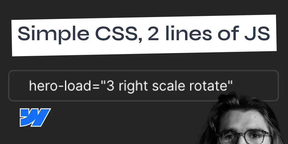
<div hero-load="3 right">Text</div>This element has both 3 and right values. We can adjust our CSS to target those values individually, like this:
[hero-load~='1'] { transition-delay: 0s;}[hero-load~='2'] { transition-delay: 0.1s;}[hero-load~='3'] { transition-delay: 0.2s;}/*...*/.loading [hero-load~='right'] { transform: translateX(40px);}This is awesome! I can now combine values to create so many different animations without having to create new keyframes.
Buuuuuuut let’s take it just a little step further!
You see, if we had one animation for “right” and another for “scale”, we stumble upon a problem.
Both translateX and scale are set on the transform property. This means one of them will override the other.
Luckily for us, CSS recently introduced individual properties for scale, rotate and translate and as of writing this, they are supported in all major browsers with 93.51% global support.
So we can now adjust our code to separate them, and we can do combinations like hero-load="3 right scale".
We just need to remember to add them to the transition-property as well.
My final CSS looks like this:
[hero-load] {  transition-property: opacity, translate, scale, rotate;  transition-duration: 0.4s;  transition-timing-function: ease;}
[hero-load~='1'] {  transition-delay: 0s;}[hero-load~='2'] {  transition-delay: 0.1s;}[hero-load~='3'] {  transition-delay: 0.2s;}
.loading [hero-load] {  translate: -40px 0;  opacity: 0;}.loading [hero-load~='right'] {  translate: 40px 0;}.loading [hero-load~='scale'] {  scale: 0.7;}.loading [hero-load~='rotate'] {  rotate: 10deg;}
Unfortunately, we can’t separate the translate property into translateX and translateY yet. But we can still do a lot with this.
Conclusion
I’m pretty happy with this solution. I can preview them directly in Webflow by adding and removing the loading class on the body. I can easily change the order of the animations by changing the value of the attribute. And I can combine values to control multiple properties. All that without having to use any external libraries, and with a tiny bit of JS to make it work.
Here is the staging link and Cloneable link for you to play around with.
I hope you found this helpful. If you have any questions or suggestions, feel free to reach out to me on LinkedIn or Twitter X.